
Case study · Measure · Decide
Gabon Infrastructure Assets
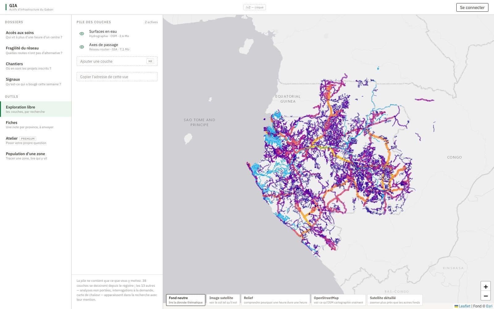
A geospatial decision-support platform that turns some fifty open layers into indicators a ministry can act on: who lives far from care, where a new centre would serve most, and which roads have no alternative.
90.7%
of the population lives within one hour of a mapped health facility. 327,232 people live beyond it.
46.1%
of those beyond one hour would be covered by five well-placed centres: 150,811 people.
45.7%
of the population depends on a single road link to reach any facility.
1 → 39%
One per cent of road kilometres carries 39% of through journeys, across 63,091 km.
Read with253 health facilities mapped in OpenStreetMap, 218 of them in Estuaire and none in Nyanga. These figures measure what the map carries, not access to care on the ground. Section 05 explains why.
01
The question
What decision-makers need, and what usually stands in the way.
Deciding where to build a road, a health centre or a power line, which sections to maintain first and which works to watch, means cross-referencing very different information: where people live, how they travel, which services exist, which projects are under way and which events threaten them. In Gabon this information often exists, but it is scattered across the census, volunteered mapping, international databases, satellite feeds and project records, with uneven dates, precision and coverage.
An indicator that is exact but computed on incomplete data, or shown without its assumptions, can steer a decision towards an artefact of the map. GIA was designed with that constraint at its centre, around three questions.
- Q1
Integration
What common base of data and models can answer different decision questions with the same building blocks?
- Q2
Translation into decisions
Which indicators serve diagnosis, prioritisation and vigilance, and what do they say about a concrete case?
- Q3
Reliability
Under what conditions can these indicators ground a decision, and how does the platform make their limits visible?
02
The platform
Four levels: sources, a common base, analytical modules, and the decisions they serve.
The sources bring together some fifty layers across seventeen themes, from rail, road and power networks to hydrography, protected areas and works in progress, plus live feeds of fire detections, air traffic and press coverage. The common base reduces them to four shared objects: a located population, a road graph, service inventories and a register of works. The modules compute indicators on that base, and the alert rules cross those indicators with works and events.
| Kind | Feature | What the user gets |
|---|---|---|
| Diagnosis | Layer catalogue | 52 layers in 17 themes, searchable, stacked with visibility and opacity |
| Access to care | Population within 30, 60 and 120 minutes of a centre, by department, with a written reading | |
| Prioritisation | Siting workshop | Gain from a centre placed at a point, a plateau of equivalent sites, a multi-centre plan |
| Vigilance | Network fragility | Road links whose cutting would isolate inhabitants from every centre |
| Works and signals | Projects, deadlines and progress; alerts from the rules and press signals | |
| Field observations | Notes taken at a work site, held offline until sent | |
| Reporting | Sheets | Printable sheets by province |
03
Methods
Five generic modules. They depend on the service studied only through its inventory, so schools or water points use the same code.
PopulationDasymetric allocation
Where do people live, at a finer grain than the census publishes?
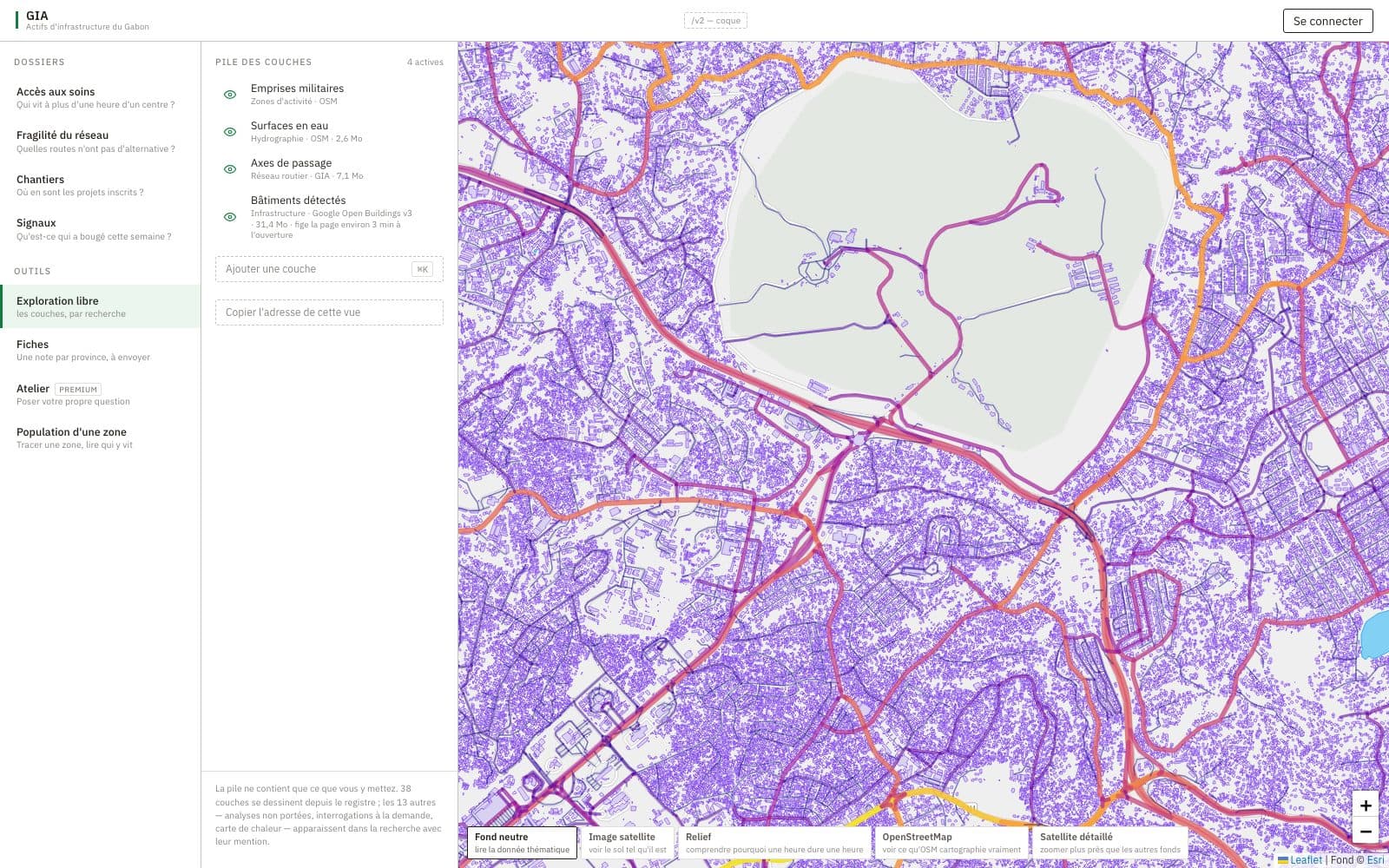
Provincial census counts are distributed to departments, then to grid cells, in proportion to the number of buildings. Buildings combine OpenStreetMap footprints with Google Open Buildings detections; overlapping footprints form a group counted as the finer of the two delineations.
35,167 cells of ≈ 7.7 km²816,791 buildings748,821 if each group counts once
AccessibilityTravel time to care
How long does it take each inhabitant to reach the nearest facility?
One multi-source Dijkstra from every facility gives the network time T(n) of each node. The inhabitant then walks to the node that minimises total time, not to the nearest road, because the closest road is often a disconnected track. The search runs in rings and stops once walking alone exceeds the best time, so the minimum is exact.
886,354 road nodesWalking 5 km/hDefault speed 30 km/hCoverage threshold 60 min
SitingMaximal covering
Where would a new centre serve the most people who are currently beyond one hour?
The gain of a candidate cell is the uncovered population it would bring within the hour. A pruning rule, proved not to change the gain, cuts the search from 113 s to about 4 ms per candidate, fast enough to be interactive. Several centres are placed greedily; since coverage is submodular, the plan reaches at least 1 − 1/e of the optimum.
FragilityBridges of the road graph
Which single road cuts would leave people with no route to any facility?
Chains of degree-2 nodes are contracted first, then one depth-first traversal finds every bridge instead of simulating tens of thousands of removals. A cut only counts when the detached side has no facility of its own: the difference between being cut off and being cut off from help. Fragility is reported in people, never in number of links.
60,340 junctions70,154 linksMinimum 25 inhabitants
LoadBetweenness centrality
Which sections carry the bulk of the country’s journeys?
Load and fragility are independent. A heavily used axis with a bypass isolates nobody, and a lightly used road can be the only access to a hamlet. The platform publishes both layers side by side and names the question each one answers.
34,134 sections63,091 kmDisplayed on log₁₀ capped at 4
04
Results: access to healthcare
Network and population of 17 September 2026. Every figure carries its inventory.
DiagnosisWho lives more than an hour from care?
Nationally, 85.6% of the population lives within thirty minutes of a mapped facility, 90.7% within one hour and 97.1% within two. The 327,232 people beyond one hour are concentrated: six departments hold 46% of them.
| Department | > 1 h | People |
|---|---|---|
| Mougoutsi Nyanga | 100.0% | 44,921 |
| Ntem Woleu-Ntem | 44.4% | 27,139 |
| Okano Woleu-Ntem | 98.6% | 20,964 |
| Zadie Ogooué-Ivindo | 95.8% | 20,232 |
| Sébé-Brikolo Haut-Ogooué | 90.9% | 19,986 |
| Haut-Ntem Woleu-Ntem | 89.0% | 18,698 |
The first row is not a field result. Mougoutsi appears at 100% because Nyanga has no mapped facility. The platform records this in plain words: a department at 100% distant is a statement about the map, not about the country.
PrioritisationHow many centres, for what effect?
A first well-placed centre would cover 52,221 people; five would cover 150,811, or 46.1% of the population beyond one hour. Returns fall slowly because distance here affects broad rural areas, not a few pockets. Overlap between centres is nil at every step, so the plan can be carried out in any order.
VigilanceWhich roads have no alternative?
The number of weak points and the population behind them do not move together. A facility added on a dead end splits the detached part into branches, so points multiply while the isolated population falls. A dashboard counting points would read a deterioration where the situation improves, which is why the platform reports people.
LoadWhere through journeys concentrate
| Share of network | km | Share of load |
|---|---|---|
| 1% | 1,769 | 39% |
| 5% | 3,155 | 78% |
| 10% | 6,309 | 88% |
| 25% | 15,773 | 96% |
| 50% | 31,546 | 98% |
| Class | km | Median load (log scale) |
|---|---|---|
| Motorway | 20 | 544 |
| Expressway | 1,112 | 224 |
| Primary road | 2,626 | 162 |
| Secondary road | 1,668 | 129 |
| Tertiary road | 1,745 | 29 |
| Unclassified road | 8,846 | 4 |
| Unsurfaced track | 42,776 | 2 |
| Residential road | 3,110 | 1 |
The measure recovers the road hierarchy without knowing it: motorways and expressways carry the highest median loads, while the 42,776 km of unsurfaced tracks carry a median of 2.
From indicators to decisionsWhat each result lets a decision-maker do
| Kind | Question | Indicator | Result | Possible action |
|---|---|---|---|---|
| Diagnosis | Which areas are far from care? | U, A60(d) | Mougoutsi: 44,921 people (100%) | Check the map first, then the ground |
| Prioritisation | Where would a centre serve most? | Gk, plateau | Basse-Banio: 52,221 people | Feasibility study over the plateau |
| Prioritisation | How many centres, for what effect? | Greedy plan | 5 centres: 46.1% of the uncovered | Size a programme |
| Vigilance | Which roads to protect? | Π, weak points | 27,542 people behind one section | Verification, priority maintenance |
| Vigilance | Which works to follow? | Alert rules | Work site near a critical link | Close monitoring |
05
Reliability and limits
What the indicators rest on, and how the platform keeps that visible.
“A declared artefact remains usable. A silent one does not.”Analytical methods for territorial planning policy, 2026
Coverage comes before any result. Volunteered mapping is thick where contributors are many: 218 of the 253 facilities are in Estuaire, which holds 62% of the population, and Nyanga has none. The gap pushes in one direction only: real access is better than what is measured. The model’s first recommended site falls in Nyanga for exactly that reason, and the platform presents it as an area to verify, not a siting recommendation.
The chain of positional uncertaintyA coordinate does not say what it designates
The same point may sit at the building, at the village that names it, or at the centre of a district. The difference is measured in kilometres, only the producer of the inventory knows it, and it can be lost at every step to the screen.
1 · What the source knows
A point in an inventory may be at the building, at the village, or at the centre of a district.
Kept: the declared precision survives the merge and sets the matching radius.
2 · What the model does with it
The point is snapped to the network at no cost. The junction chosen, and so the access time, can change with the position.
Kept: the direction of the bias is declared as unknown rather than omitted.
3 · What the screen promises
A dot of fixed radius over imagery promises metric precision. The reader zooms in, sees no building, and concludes the data is wrong.
Kept: the symbol carries the scale of what is known, and the popup shows the year of the data.
AssumptionsEvery convention, with the direction of its bias
| Assumption | Access | Gain | Fragility |
|---|---|---|---|
| Incomplete inventory of facilities | − | + | + |
| Position at the inhabited place, not the building | ? | ? | ? |
| Facilities snapped to the network at no cost | + | + | · |
| Listed facilities assumed open and equivalent | + | ? | − |
| Mapped network assumed complete | − | ? | + |
| Constant speeds, without season or relief | + | ? | · |
| Straight-line walking at constant speed | + | + | · |
| Population proportional to buildings | ? | ? | ? |
| Components without a facility excluded | · | · | − |
| Single and total cut | · | · | − |
| Greedy plan | · | − | · |
Key+ overestimates − underestimates ? unknown · no effect
Design principlesFour rules for every indicator
Provenance
Every indicator carries the source, date and licence of the data that produced it.
Declared assumptions
The model’s conventions are named, with the direction of the bias they introduce.
Ranges
Where the data does not settle a convention, the indicator is given as an interval.
Prudent thresholds
Thresholds round towards the side that makes neither statement false, and whatever they exclude is listed by name.
06
How it was built
A dependency-light product, designed to be recomputed, tested and read.
GIA runs on Flask, SQLite and Leaflet. The analyses use only the Python standard library, so the whole platform still deploys on shared hosting. They run as batch jobs that write artefacts the API serves, never per request, and every artefact records its own caveats so a figure is never shown without what it rests on.
| Rule | Fires when |
|---|---|
| Overdue project | Past its due date and still incomplete |
| Underserved department | Fewer than 25% within one hour, for at least 2,000 inhabitants |
| Project near a critical link | A work site within 15 km of a link that isolates at least 1,000 people |
| Project in a negative province | An unfinished project where press coverage is turning negative |
| Negative sentiment spike | A province’s negative share jumps against its own 30-day baseline |
| Fire near a project | A NASA FIRMS detection within 10 km of a site, confidence 50 or more |
A rule whose inputs failed to load is declared not evaluated, with the date collection stopped. Silence because a source failed is not the same as the condition clearing.
07
What comes next
Developments suggested by the reliability analysis.
The paper
Hodologic Research (2026). Analytical methods for territorial planning policy. 21 September 2026, 20 pp.
Next · Research